Empowered Futures
Official Website
The official website has been a valuable asset for this Canadian non-profit organization to connect with the community and empower the next generation of young adults as they transition into adulthood. To create an environment where young adults can find suitable mentors, establish meaningful mentorship relations, and have these relations effectively supported by the platform. As part of this movement, the website has played an important role in attracting more youth to join the community and seek support for the programs carried out by the organization. As one of the design leads and a member of the UI/UX design team, our team was assigned to recreate the entire branding and website for this purpose.
.png)
.png)
RESEARCH & ANALYSIS
The committee board is continually striving to enhance and update their organization's culture. Recognizing the website's crucial role in attracting and engaging active young adults to promote self-empowerment, their initial step was to instruct all teams to prioritize making the website more captivating. The current website is somewhat outdated and lacks essential information necessary to inform the younger generation about the resources offered by the organization to help them thrive and succeed in life.
The Problem
The Solution
Utilizing a research-first approach, our UI/UX designer team created a responsive, intuitive, and modern website design that met the goals of the committee board. The design not only improved usability but also embraced a futuristic, bold, and trendy aesthetic in line with the interests of the upcoming generation.
Advanced, neon, techy, avant-garde, nerdy, artistic, and futuristic, sense of empowerment, growth, and hope.
Brand Personality
Chairwoman Kickoff Interview
Prior to the interview, all teams prepared a rough outline of topics to be discussed. In order to grasp the chairwoman's goals, we prioritized her insights on what the website should communicate, the vision it should fulfill, the kind of experience to offer the target audience, and the expectations of the younger generation that are crucial to consider when making important decisions.
3D imagery focused, videos to understand EF programs, scripted content of videos, an easy-to-navigate straightforward experience
For Young Adults
Less clicks, minimize wording, story of the organization (no clicking until they read the story), more information on the mentorship and volunteer programs
Site Features
To convey who we are, what we do, what we offer, and why they want to be a volunteer, mentor or a mentee in the mentorship program
Main goals of the site
User Personas
Since we have gathered the intentions of the board committee and its chairwoman, it is time for us to further validate these intentions with potential users and find supporting points on how to reach these goals design-wise and direction-wise.


During the interview with the chairwoman, we needed to verify the website's subject hierarchy. This is important because the flow of the website is crucial for users to navigate easily. We further improved the existing sitemap based on feedback end-users.
Sitemap
.png)
DEFINE AND IDEATION
The team's focus was to first generate ideas, make mistakes, and brainstorm multiple ways to create a website that is innovative, advanced, and techy, according to the conclusions made during the research phase. Then, all of the members shared relevant references, including screenshots, inspirations, 3D graphics, and wire flows. Every member was invited to sketch out ideas on paper. Once we gathered suggestions and ideas, it was time for us to call for a meeting to decide on a path that aligns with our goals.
Our motto was to "Go crazy and try our best to make mistakes!" Therefore, it opened up paths for new innovative directions that we never thought we could come up with.
Brainstorm
Some Sketches and Lo-fi Wireframes
.png)


Billy's Sketch
Nancy's Sketch
My lo-fi wireframes
Moodboard
This artifact has helped us determine the direction to follow in terms of style guide, theme, patterns, and visual outlook. To ensure consistency with the organization’s chairwoman’s expectations and to create an environment for young adults to feel motivated, invited, and engaged, we made sure to convey words like trendy, tech enthusiasm, energy, futuristic, modern, geeky, and openness through the look and feel of the website.

BRANDING AND DESIGN
Components
A responsive design system was then established with respective widgets and typography to match with the theme and vision of the website. The guide was later on modified to accommodate various features and functions of the user flows of the website.


Light Mode
Dark Mode
Hi-fi Wireframes - Teams to handle different sections
Blog Listing Pages


These type of blogs offer valuable insights, resources, and advice that enhance the mentorship experience offered by Empowered Futures and assist young adults in overcoming challenges related to career, education, and personal growth. They create a sense of community by sharing success stories and practical tips from mentors and peers, inspiring confidence and resilience. Furthermore, regularly updated blogs maintain fresh and engaging content, attracting more visitors and improving the site's visibility. Ultimately, this expands the reach and impact of the mentorship program.
News stories provide timely updates on events, achievements, and opportunities, keeping participants informed and engaged. They highlight success stories and milestones, which can inspire young adults and build credibility for the EF mentorship program. By showcasing recent developments, the EF website's media section becomes a dynamic hub of information, helping to attract new participants and partners while reinforcing the program's relevance and impact.
Dark Mode
Light Mode

News Story Listing Pages & Event Pages


Having a dedicated section to view information about events and register for the events of EF allows users to easily explore upcoming events, stay informed about dates, locations, and topics, and make informed decisions about participation. A streamlined registration process on the same platform enhances user experience by eliminating barriers to entry, encouraging more sign-ups. This integration also allows the organization to manage attendance more efficiently and foster stronger connections with its audience.


.png)
.png)


While each team member was working on their respective roles, it was essential to divide tasks among teams. Therefore, team leads and members were assigned to handle different sections of the website such as the home page, volunteer pages, and media pages.
I was responsible for leading the media, blogs, news, and events sections of the website. My duties included leading the team members to complete tasks related to designing user-friendly and intuitive wireflows and web pages specifically for the media section. At the end of the process, I went in and did a thorough round of detail checks, making sure everything was pixel perfect.


Dark Mode
Light Mode
REVIEW & IMPROVE
In the tech industry, reviewing, testing, and maintaining web/app pages is an ongoing task. After completing our initial round, we discussed with the development team to get their feedback and clarify any doubts. We conducted various tests with internal teams, especially with the development team and other potential users, to ensure everyone was on the same page.
Some Changes Include:
We decided to change the blog-news card style based on feedback from testing. It's important to display a brief description of the blog content to attract readers. We also felt that the gradient-colored text was too distracting, so we changed the colors to neutral tones. Instead of using an arrow icon, we made the entire card clickable to provide a more user-friendly experience.
Before

After
.png)
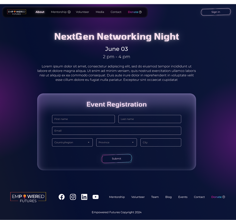
Several versions of the event sign-up page were designed, but it was ultimately decided to only include the essential form fields in order to effectively convey the information to the user. The layout of the page was organized to ensure that users could easily grasp the details presented.
After conducting several tests, it was decided to prioritize the registration form instead of adding other sections such as "more stories" and "more events." This was mainly done to minimize clutter and guide the user to successfully register for the event by entering fewer form details.
Blog-News Card
Event Sign-up Page

Before
After
After a user completed their registration, it was unclear whether the registration was successful because there was no confirmation page. Users were also expecting to receive a follow-up email as proof of registration.
To address this, we decided to show a message confirming that a confirmation email had been sent to their provided email address. Additionally, we included a summary of the event details. To further improve the confirmation process, we added options for users to add the event to their phone calendar and access other event details.
Key Learnings
FINAL THOUGHTS
-
It was quite challenging to find the right balance between the expectations of the client (Chairwoman of the EF organization) and the goals of young adults who are in the process of becoming more confident, emotionally intelligent, and resourceful adults. Open communication and regular testing helped us to overcome those challenges.
-
With the findings from interviews and discussions, finding the perfectly balanced solution was a bit time-consuming because there were many different paths on how to redesign the current website to a modern, trendy, youth-friendly environment. The voting system helped us to finally find the appropriate solution at the time given the time constraints.
-
Empowered Futures was a successful end-to-end responsive website project. The design team is excited to see the new website come alive once the development team is ready to release the MVP. We are currently working with the EF development team to implement the remaining functionality and make further improvements to align with end-user goals and the vision of Empowered Futures organization.